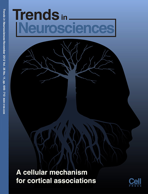
Prof. Matthew Larkum from Charité Berlin asked me to illustrate his neuroscience research for a cover of the journal Trends in Neurosciences. Here, I’d like to give some insight about the different steps of the design process; how we developed the concept and came up with the final design that made it onto the cover of the journal.
I hadn’t worked with Prof. Larkum before when he asked me if I could help him with the design of his cover. When you work with a client for the first time, you never quite know what to expect. Each of them has his own modus operandi and for many of my clients it’s the first time that they hire a designer.

Four concepts, based on stock images, that the editor of the journal suggested.
In this case there wasn’t much of a briefing. The editor of the journal had put together four quick compositions of some stock images that she considered to be remotely related to the pyramidal neurons that Prof. Larkum’s research is about.
My first, unfinished attempt
You may not be surprised to hear that I am not a big fan of the idea to put some generic stock graphics on a cover, that are at best vaguely related to the research they are supposed to illustrate. Since I didn’t know much more about his publication either and had no idea how closely he wanted me to stick to those concept ideas, I picked one of them and started to work on it. My idea was to make the ‘tree in the brain’ in the shape of a neuron where the branches and roots resemble dendrites and the axon. On the right you see my first attempt at the concept. Obviously it’s way too dark and the branches are not finished.
I sent in the draft and we had our first meeting at Charité. Prof. Larkum took much time to discuss his publication, explain to me the research he is doing and even showing me around his lab after I asked if I could see some real neurons. (Ha, I wish my Prof would have taken that much time for me when I was still a PhD student.) When we discussed the figures of his publication I instantly took a liking in this one:
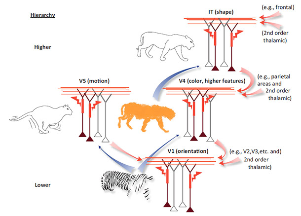
The tiger catches attention and I also liked the concept; how the information that we receive (in this case watching a tiger) is broken apart into pieces and processed at different layers of neurons in the brain. I thought this would be a great starting point for a cover illustration, so I got started working on that concept.
The tiger->brain flowchart
My idea was to create a stylized and simplified flowchart that would be more or less self-explanatory. A journal cover is not the same as a figure in a publication. A cover design may be simplified and should need little or no text to make sense from.
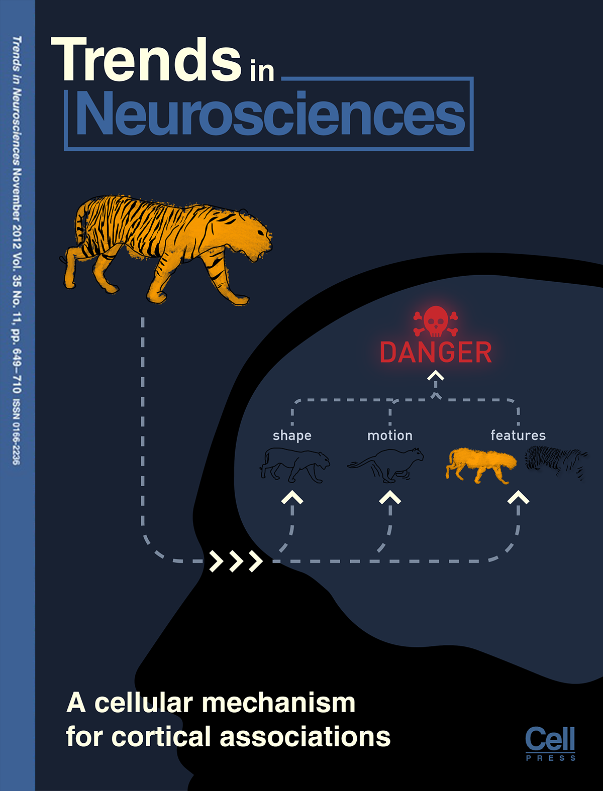
The design on the right is what I came up with. The colors are still a bit dark but I was pretty happy with the concept. And so was Larkum. He liked it a lot. However, both of us were concerned that the journal editor might not want to put a simple schematic flowchart on their cover.
So we discussed further ideas based on the tiger properties. Prof. Larkum wanted to emphasize the pyramidal neurons and illustrate those, as they (selectively) pass on these kind of information across the different layers within the brain.
Meanwhile, I was thinking of ways to display the layers of the brain in an abstract and attractive way. There was this vague vision of how the individual pieces of information are stored in different compartments in the brain. I’m not a neurobiologist, so rather than hard science this was more of an idea of how one could show certain aspects of the brain in an abstract way.
Recently, I came across the website scriptographer.org which offers useful scripts for Adobe Illustrator. One of their script produces patterns of hexagons:


Why the wasp?
I liked that style a lot and decided to use something similar for my imaginary brain compartments. Prof. Larkum sent me images of his pyramidal neurons. At first I considered to draw the neurons in 2D in Adobe Illustrator. But then I thought they might look better when modeled in 3D, although it is a lot more work. At this point I had a clear idea of the cover in my head and decided to properly work it out before showing it to the client. What I was trying to illustrate was that information that is coming in through a higher level of neurons (here: shape, color and pattern) is being handed down to a lower level and checked against existing memories that match such descriptions.
“Hmm, I see this animal and it has a yellow-black striped pattern. Where have I seen this before? Ahh yes, a wasp. That was a painful memory, maybe the animal I am seeing here is dangerous, too…”
I was pretty happy with the visual appeal and showed it to the client. Prof. Larkum liked the style, too, but wasn’t happy with my interpretation. “What’s the wasp doing there?” he asked. Apparently, I had wandered off to far from the starting point.

My favorite version of the cover
Back to the drawing board we discussed further ideas. Scratch the animals and put the different properties of the tiger on the bottom. Larkum wanted the cover to look less two-dimensional. He also wanted to include an action potential. I felt that the neurons on the top should be connected to something rather than ending in nowhere. So I placed another layer of abstract cells there and attempted to give them a ‘brainy’ look. The Prof said with a bit of imagination they looked like the barrel cortex.
I was very happy with this version but Prof. Larkum decided to spend a couple of extra Euros and try out another idea he had: a lightning storm in the brain. After all, neurons do send out electric impulses, so why not draw them like lightning bolts?
I did like that picture, too, although now I felt that we were wandering off quite a bit from the initial concepts we had in mind. By now, rather than depicting a certain process happening in the brain, the cover design was more of a collage of different ideas and concepts associated with the functioning of neurons in the brain. But that’s okay. In the end, all a cover has to do is catch the interest of the reader and I hope we managed to do that:
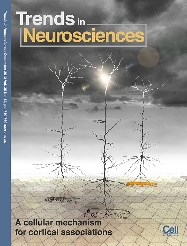
Final version of the cover – Lightning storm in the brain